On the whole, I feel that this brief was a success. I feel that the three zines I created don't really fit together at all but that was the idea I had at the start. My main objective is to carry on making zines, a new one each month as part of a self-initiated brief. This way, I can work on different styles, which I already have started to do during the brief which will help me develop my skills in different areas. I think it's good to do something you enjoy at the side of practical work just as a release and to help you keep challenging yourself in different areas of graphic design.
I undertook a substantial amount of research into zines and different styles of zines before I started the brief. I wanted to experiment with the manufacture of the booklets. Printing and putting it all together myself as well as different methods of book binding. In this case, i hand-sewn the spine of each booklet. I feel that this is more rewarding than just sending off and paying a lot of money for somebody else to do it. To me, it's important that I learn more hand-made methods which will eventually make me more versatile and have more design approaches for future work. I feel that on the whole this project has helped my develop practical skills, both design styles and book binding.
As far as breadth of initial ideas, i feel i took this on quite well. From the initial workshop we undertook, i initially started by going with one idea, but i feel with the time we had this would of been as easy option which is why i decided to take three separate ideas to make a collection of different zines (different every month)
If i was to do something differently for the brief, i would maybe have pushed myself further when it come to the final product. Looking back on the final products, they look a little bit too hard to understand. I think because I have been working on the brief for quite a long time, i have lost interest in the subjects i chose. This is something i can't afford to do with other briefs because for me, it's really important that i'm enjoying what i'm designing. Also, i think i tried to take on too many styles in the end. This was the initial idea, but maybe a little bit too much for me to take on.

Hot-Dog Booklet
I really enjoyed this brief. I feel that it was more rewarding that our work was on sale at the Leeds Book Fair and also helped to give me some idea of if my work would succeed in the real world. I made 10 booklets and sold 4 at the book fair which i was really quite happy with. I didn't expect to sell any so this was a bonus.
The actual content of my book, I feel worked well. It was a fun subject to work with and my main concept was to make the Anatomy of Type more approachable to creatives and students that wouldn't normally be interested. I did this by giving the book a little bit of a branding with a nice logo and poster but then also containing the most important information in bite size form. In my opinion, i have succeed in this and because I put my blog on the back, i got some new followers and managed to get feedback via other peoples blog and also quite a few reblogs which helped et my work out there. (see below)
Breadth of initial ideas for this wasn't very many because we had to go with one idea and roll with it due to times scales. When I started by taking photographs of letter A's that led me onto working with the anatomy of typography. This linked in well with principles what we was learning at the time so i felt that this would be the ideal way for me to learn more about the subject through design.
If i was to change anything about this brief, i would have probably made the book a slightly larger size. The poster was nice but it was just A3 size when opened out which isn't really very impressive for a poster. The booklet worked well however at a smaller size, so i had to sacrifice one for the other.


Type & Grid
I really enjoyed this brief and learning about all the different methods behind type and grid. I felt that the workshops we're very useful for me personally and I have surprisingly been really interesting in grid and layout work recently. I like the idea of structured design and modernist design so this was perfect for me to experiment in fields of design that I have been interested in for while now.
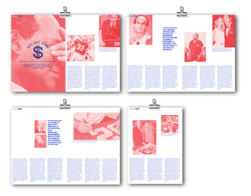
I feel that I struggled with the original article I had, in which I created the 18 initial thumbnails for. I didn't really feel the subject fit into the design I wanted to experiment with so I decided to change the article I was working with. As far as breadth of ideas go, I created another full set of thumbnails for the new article i chose and I worked with blue and red and experimented quite a lot before finally settling on my layouts and perfecting them before i moved into Indesign.
Personally, the InDesign workshop was a massive help for me as I wasn't very familiar with working in Indesign before. It's so much easier to create layouts in and just makes sense, so I was happy to pick that up fairly quickly and this brief really allowed to experiment within Indesign which will be great for future editorial work I will be creating.
The final result of my editorial layouts I feel was a success. Editorial work isn't really something that I have done before so I'm really glad that I have learnt so much this year and managed to create some nice looking layouts in the style that I have wanted to experiment with for quite some time now. This is a great starting point for me to move on into different areas of design, step out of my comfort zone and experiment more.
Colour Theory
I found that the initial workshops for colour theory was really useful and definitely another part of design that i had overlooked in previous years. It is so important to consider and plan colour choices carefully and by learning which colours work together and in what way is going to be so useful for my future career as a designer.
I felt that the experiments that I did after all the workshops helped me gain a better understanding of how colours react with each other and it was a good way for me to help get my head around it. I feel that best way to experiment however is within my own work and I have seen myself take a much more structured and thought-out approach when choosing pantone colours to work with and also when working with RGB and CMYK and how colour transfers from screen to print. For me, this is by far one of the most important factors in design.

Hierarchy Of Type / Zombie Type
Again, the workshops we did on Hierarchy and Anatomy of Type were really helpful for my personal practice. It allowed me to gain a really good knowledge of type is all aspects which is such an important aspect of design.
The original 'zombie' typefaces and families that I created were really poor. I found it hard to make any good looking letterforms from the letters we cut up. This wasn't a great task for me so i decided to move into different experiments that might help my practice in the same way. I decided to take on a personal experiment of blending two typefaces as well as creating my own which was a much bigger help for me in this field.
I feel that the typefaces i created as part of the extended Zombie Type task were a good way for me to put in the practice and create typefaces that are constant and work as a set and most importantly, work when written in a sentence. Because, both the typefaces i created are quite stylistic, I feel that they have potential to work well in the current design market.

Leave your comment